VIRTUAL REALITY VIEWER | Tourism Australia & Condé Nast Traveler
Pioneering a seamless experience from the print magazine to virtual reality
This project made me love UX. Great design isn't pretty, it's functional.
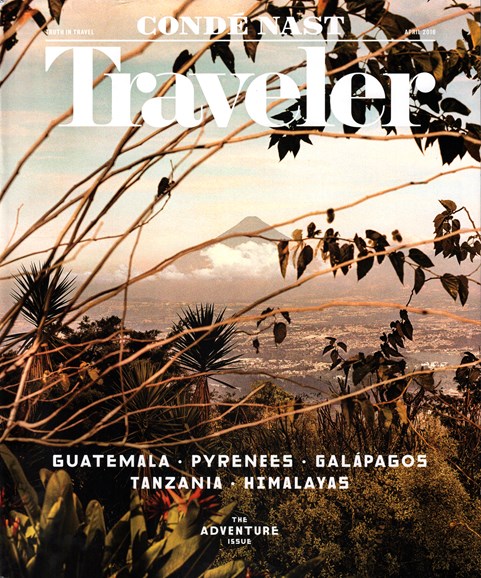
WHAT IS IT: A Tourism Australia branded VR viewer (like Google cardboard) delivered attached to Condé Nast Traveler magazine, taking readers instantly from the magazine page to an Australian diving experience. This is an innovative first for Condé Nast.
PROJECT TERMS: Full-time Condé Nast employee, working with Tourism Australia advertising & CNT magazine integrated marketing teams
MY ROLE:
UX Designer:
UX Strategy and User Testing;
Project Coordinator;
Print-to-Mobile Strategist
Challenge: Readers need to assemble their own VR viewers to experience the virtual reality content
Provide magazine readers with physical VR viewer and access to digital VR content
Create a fully branded experience during entire print-to-mobile user journey
Make viewer assembly quick and easy by providing intuitive instructions for readers
Print-to-Mobile Strategy: Designing the user journey from print magazine to VR experience
Utilize the physical capabilities of print magazines with the engaging opportunities of mobile virtual reality
Strategy: attach flat paper viewer to the magazine via polybag, prompt to access digital VR content on mobile
Carefully manage translating the specs across teams for both digital design and print production
User Testing: It takes 20+ minutes to assemble the VR viewer. No one's going to do that.
Viewer has no assembly instruction, not intuitive
Users need assembly instructions or they'll never use it
Familiar users take about 8 minutes to construct, but it's a reusable product
UX Utility Over Beauty: The need for instructions is more important than a seamless aesthetic
original spec file
branded file with visual diagram assembly instructions
User testing made it quickly apparent that the original branded VR viewer was not intuitive to assemble and needed to be rethought, otherwise readers would give up before accessing the content
The viewer needed assembly instructions, which required a compromise on aesthetics from the original seamlessly branded design. Users ultimately care more about a functional design over a beautiful one.
Iterative Solution Brainstorming:
Color-coding the folding parts
providing qr code to instructional video
winner! visual diagram
Users responded best to instructions with a visual diagram involving fewer steps and being immediately digestible
Final Deliverable: A user experience carefully designed to subtly usher readers from print to VR


